TRIFOLD BROCHURE
Project Overview
Project Title: Trifold Brochure for the Department of Electrical and Computer Engineering
Project: Trifold Brochure
Duration: 1.25 months
Role: My role as the publication designer was to explain information about the program while also gaining the attention and curiosity of future students.
Problem: To create a brochure for prospective students coming to Chico State that shows the achievements and career opportunities for the Department of Electrical and Computer Engineering.

Solution & Programs
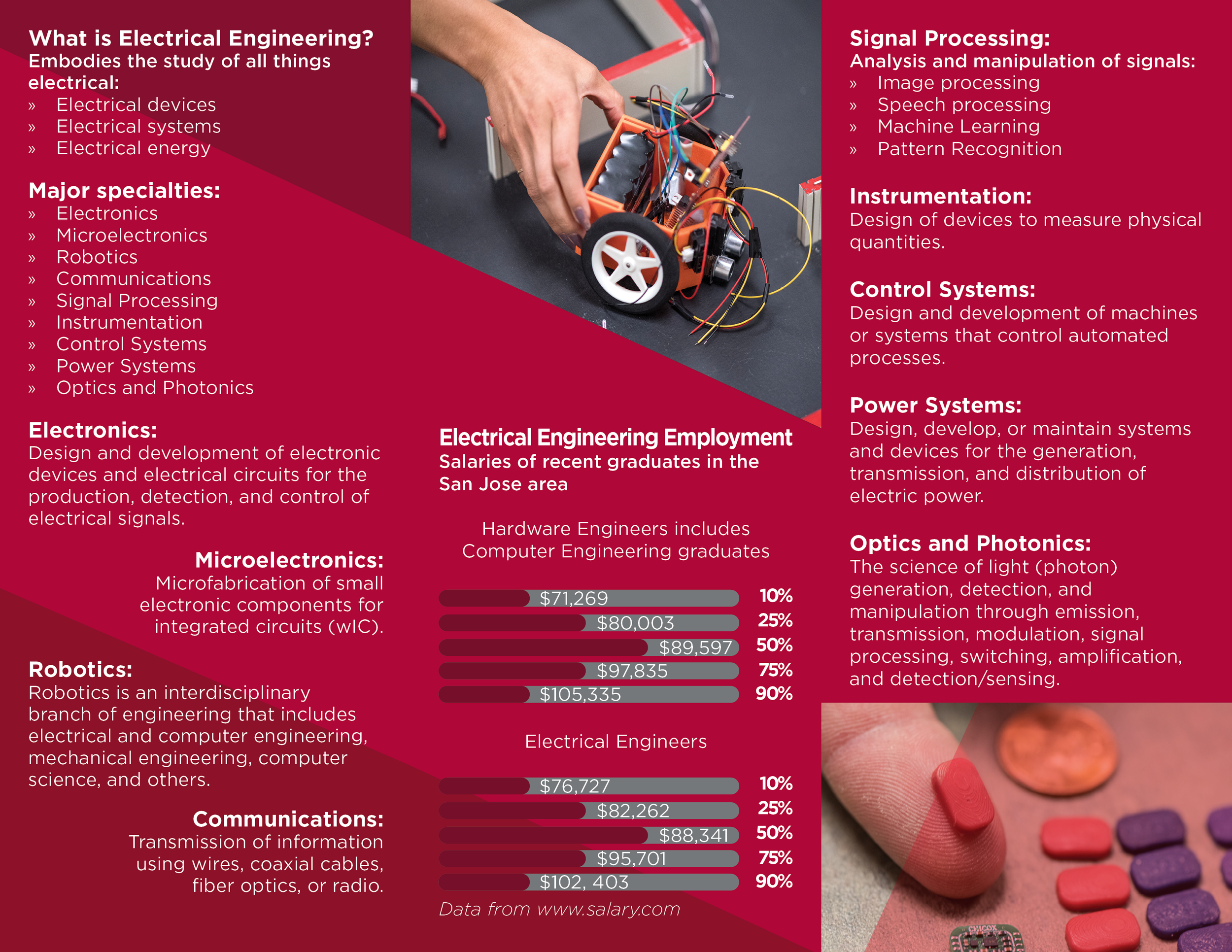
To keep the brochure organized and readable I had to create guides that worked well enough to include the text given to me as well as my images and graphics. Also while incorporating design principles involving balance, contrast, unity, and proportion. Placing the images could be difficult however a grid that works with all folds of the brochure made it much easier to place. Organizing the brochure from left to right, it was more acceptable to start with an introduction to the department, leading into context and career wages, then concluding with achievements and awards. It also makes sense to keep the color scheme the same as the colors used for Chico State, especially since it was for a department at the school. Also having to follow the branding guidelines for Chico State such as images used from the department and the Chico State University Seal. The grid, unity, and balance of the design make it easier for future students and parents to read through and understand.
Programs: Adobe InDesign & Adobe Illustrator
You may view my work in the gallery below. Enjoy!
Research
The initial idea for this project was to figure out how to create a brochure for a department that not only delivers important information and statistics about electrical and computer engineering but also grabs the audience's attention. This led me to think about my target audience; which were future students at Chico State and high school students looking for a career path in engineering.
I started to do some research as to what brochure the engineering department already had placed. The design was very clean and balanced, however, it lacked emphasis and movement through the pages.
Challenges
I began working on images and design elements that would give the audience something to look at and find interesting when it comes to engineering. However, I ran into a bump in my design process when I was losing focus on the information side of the brochure and focused too much on the imagery and graphics which caused me to break the grid too much or pages were to compacts as to where it was ineligible and ineffective when it comes to the rhythm of the design. Catching this early I was able to get back on track and created a rough layout of how balanced it must be with images and text.
I also used secondary sources employed for the research, including departmental websites, past publications, articles, and brochures. Doing so the research was found on the department website from Chico State, and the images used were also acquired from their department for me to use on this project. I wanted to incorporate images that catch the attention of students and create that “WOW!” factor when it comes to convincing the audience to start their education with engineering at Chico State.
One of the challenges I faced was wondering how the alignment of subheadings is going to look compared to the body text. Also if the images I use are going to relate to the text on the same panel or if they’ll be completely unrelated. I did use group-related elements to find a solution in how I’m going to use the grid in regards to alignment, at first I was thinking of breaking the grid but it didn’t help much with how little room you have on a brochure. So I cropped images to create more negative space to try to allow more breathing room and consistency throughout each panel as well as experimenting with different alignment options and using different weights of my fonts to emphasize the subheadings and context without having to change the font size too much, this way it creates a better visual in how the text and images unite. Using a red background was difficult at first because I would have to match it with white text, but how would I use that text so that it’s readable? I created contrast within the background, for example, different shades and tints of red to create distance between lines of text or using shapes to draw your eye off the bleed of the panel to the next.
Learnings
Everything went smoothly since I used a grid that helped me stay consistent with the images and text. I also learned that it works best to begin working with the text and photographs, before adding color and graphics. By doing this, I was able to gauge how much space should be allotted for each panel. In order to avoid drawing too much attention away from the material, I was advised to keep my visuals tiny but not invisible throughout the project. With enough patience, creativity, and problem solving I successfully created a project that gains the curiosity of the next generation of engineers.


